Our client on this project knew her existing brand didn’t match the look she dreamed of, but didn’t know how to get there.
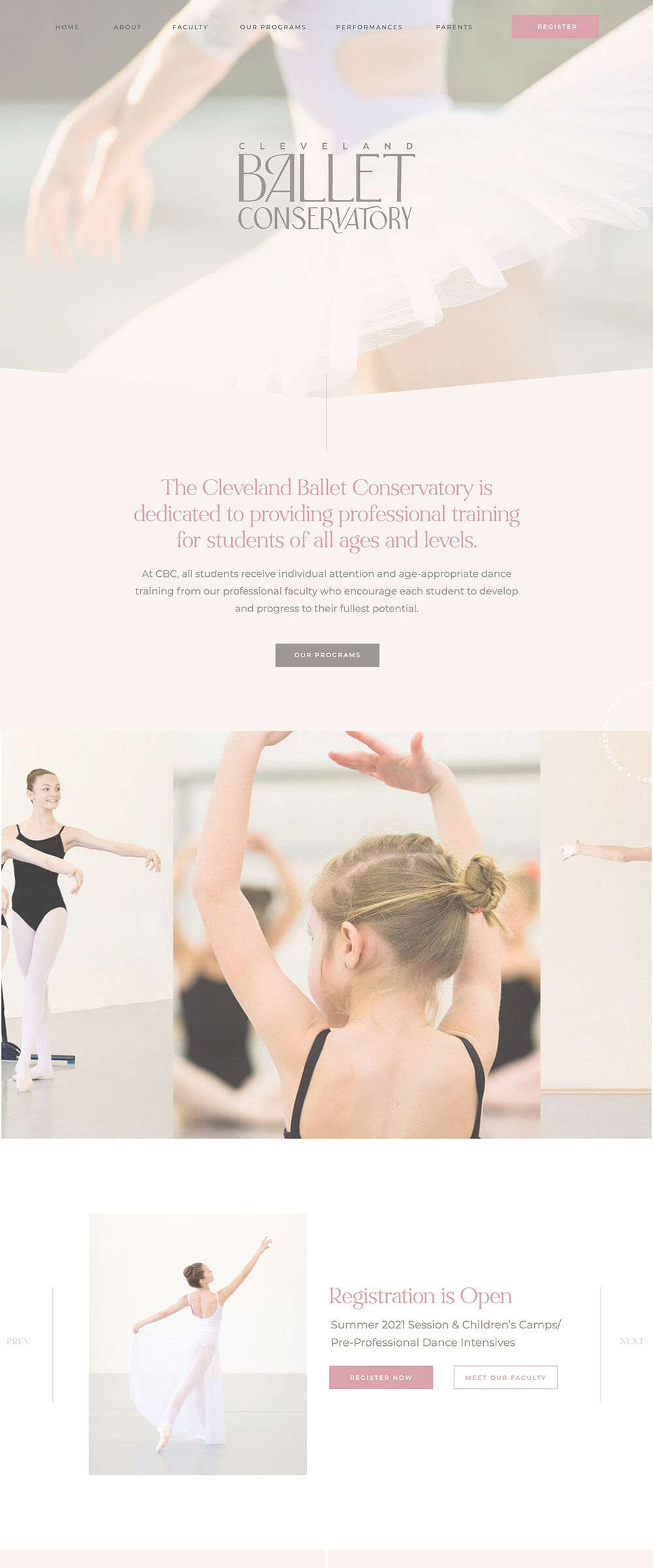
In our first meeting, she said she wasn’t a “pink” person, but envisioned a light and ethereal look.
Through our Discovery Exercise, we uncovered that it wasn’t that she didn’t like pink—she just didn’t like the bubble-gum pink often used in ballet brands. She wanted her brand to feel elevated, and was actually drawn to pink when it was done in a sophisticated way.
It was important that the vibe has a professionalism to it — to reflect the state-of-the-art facility and the classically-trained, experienced faculty — but they also treat all their students like family, so it also needed to be warm and inviting.


