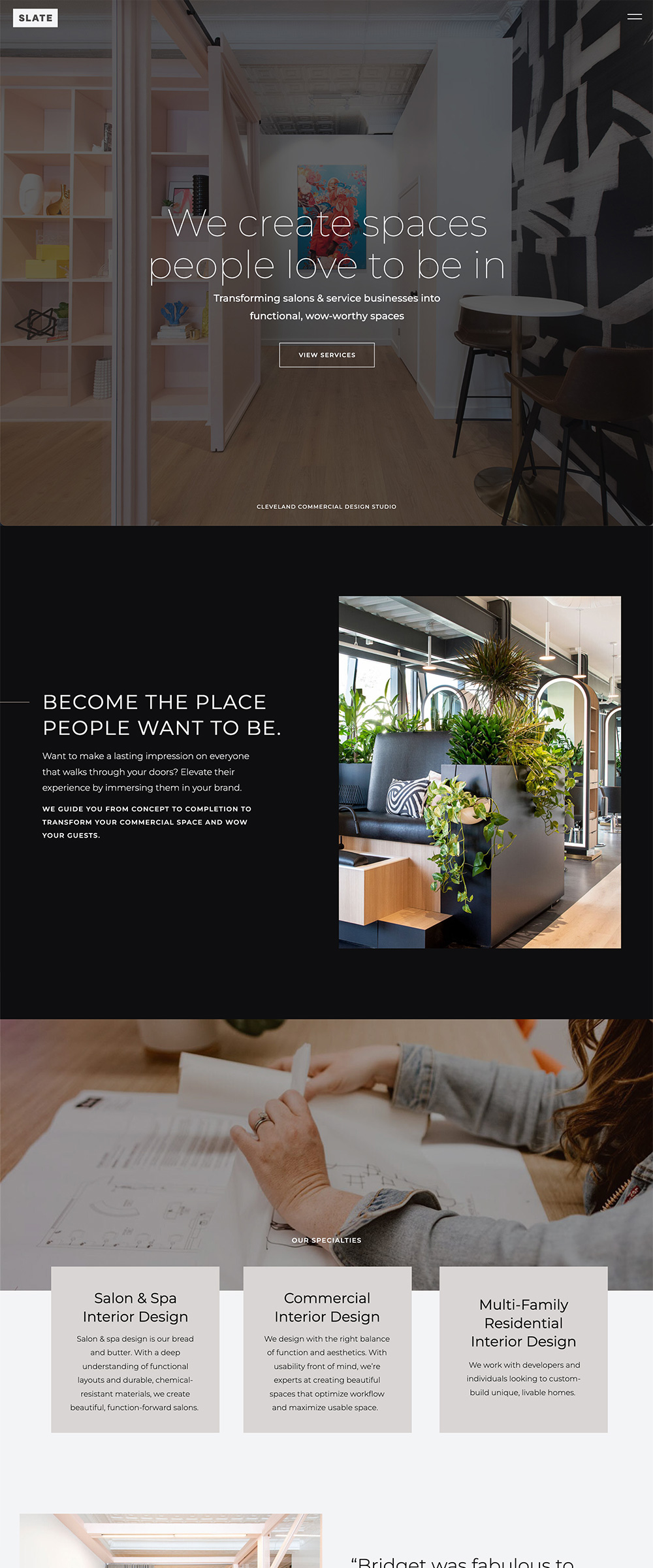
Most interior design websites are pretty stark—usually with a solid white background. And no shade, we love us a white background! But we also loved when Bridget came to us with a different vision.
She wanted her work to stand apart, and a black background was an impactful first step. We also used a large, thin sans serif for the headlines, and a smaller, bold typeface for subheads.
The contrast of white/black and thin/thick really stands out on this bold & impactful website.
We'd love to help! We specialize in creating websites that are strategically designed to feel like YOU and book more of your dream clients.
Want something like this?
< Back to Showcase

